AirAsia move
Creating a Responsive Design Optimized for Both Mobile and Desktop Users.
ROLE
UX/UI Designer
tool
Figma
YEAR
2024


I understand the frustration and inconvenience you experienced when dealing with confusing navigation, unclear flight options, and a complicated booking process on the AirAsia MOVE platform.
We redesigned the AirAsia MOVE website to address these usability issues and enhance the overall user experience for travelers.
Project Overview
It's important to provide a more intuitive and faster way for users to find information and manage bookings. A clear and straightforward booking process, especially for mobile users, is essential. Additionally, an updated design with more interactive and user-friendly elements will enhance the overall experience for users.
Timeline
From research to final prototype in 4 weeks.
Background
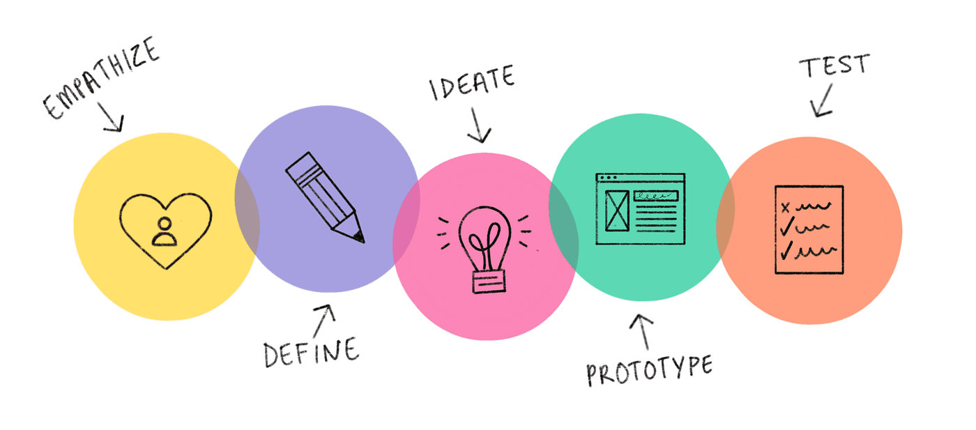
Process
This category details the step-by-step approach taken during the project.
Stage 1: Empathize
Conducted market research to identify existing time and task managing challenges and user preferences. Research methods included user interviews, competitive analysis, and user personas.
Stage 2: Define
Clearly articulate the problem to be solved and the goals of the project.
Stage 3: Ideate
Generate ideas and solutions to address the identified problems and needs.
Stage 4: Prototype
Create wireframes and prototypes to visualize the solution and gather initial feedback.
Stage 5: Test
Evaluate the usability and effectiveness of the prototype with real users.
Stage 1: Empathize
We need to understand the users, their needs, and the pain points they experience with the current AirAsia MOVE website.
Research
Competitive Analysis
We compared three competitors (Booking.com, Expedia, and Skyscanner) to identify strengths and weaknesses in their responsive designs.
User Interviews
Conducted with frequent and infrequent travelers, including tech-savvy and less tech-savvy users.
Key Findings:
Pain Points: Users struggled with confusing navigation, unclear flight information, and a complicated booking process.
User Goals: Quick and easy booking process, clear flight information, and seamless payment experience.
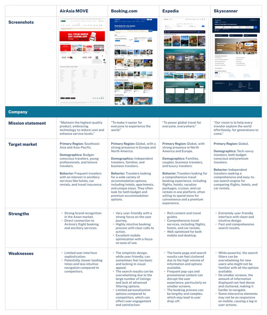

Competitive Analysis
Currently has a functional but potentially less polished design compared to top competitors.
Mobile responsiveness and seamless experience are critical areas for improvement.
The navigation can be cluttered, making it difficult for users to quickly find what they need.
Design elements may not be consistently applied across different pages, leading to a disjointed user experience.
The mobile interface may not be as smooth or intuitive as the desktop version.
Stage 2: Define
We create clear problem statements and define goals based on the insights gathered during the Empathize stage.
Problem Statement
The current website's navigation is confusing, which is causing user frustration and abandonment. Users are struggling to understand flight options and complete bookings due to the complexity.
How should we redesign the website to solve this problem and reduce the likelihood of successful conversions?
Research Objectives
Identify common issues users face when navigating the current AirAsia MOVE website.
Determine the specific pain points in the flight booking process.
Understand user preferences for accessing additional services such as hotels, car rentals, and travel insurance.
User Goals
Simplify navigation and booking process.
Ensure a responsive design across devices.
Business Goals
Optimize the booking flow and promote additional services.
Address pain points and provide a seamless experience.
Stage 3: Ideate
Generate ideas and solutions to address the identified problems and goals.
Our Goals
Simplify the navigation and booking process to make it intuitive and user-friendly. Ensure that users can easily find and understand information on flights and additional services.
Create a responsive design that provides a consistent and seamless experience across mobile and desktop devices.
Implement a clear and concise layout that highlights key functions and services.

Sitemap: key pages
Simplified Navigation: Introduce a sidebar menu for desktop and a hamburger menu for mobile to streamline access to key sections.
Home Page: A central hub with access to all main sections. Provides users with a quick search for flights, hotels, and transportation.
Flight Booking
Hotel Booking
Transport Booking
Travel Deals
My trips: Manage their bookings and plan activities.
User Flow
User flow for booking a flight to Kuala Lumpur, Malaysia on AirAsia MOVE.

User Personas: Goals

Budget-Conscious Leisure Traveler
Find the cheapest flights and accommodation
Discover new destinations and travel deals
Book travel extras like car rentals and activities
Plan trips efficiently within a budget

Frequent Business Traveler
Book flights and hotels quickly and efficiently
Access reliable and up-to-date flight information
Manage bookings and make changes on-the-go
Earn and use loyalty points

Retiree Leisure Traveler
Find comfortable and senior-friendly travel options
Access information on travel insurance and medical assistance
Discover leisure activities and guided tours
Ensure easy booking processes

Solo Adventure Traveler
Discover unique and adventurous travel destinations
Book flights and accommodations that are flexible and affordable
Access travel guides and tips for solo travelers
Share travel experiences and photos on social media

Family Vacation Planner
Book flights and hotels suitable for family travel
Find family-friendly destinations and activities
Ensure a smooth and hassle-free travel experience
Access customer support easily
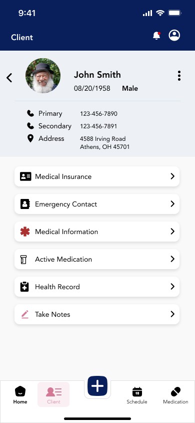
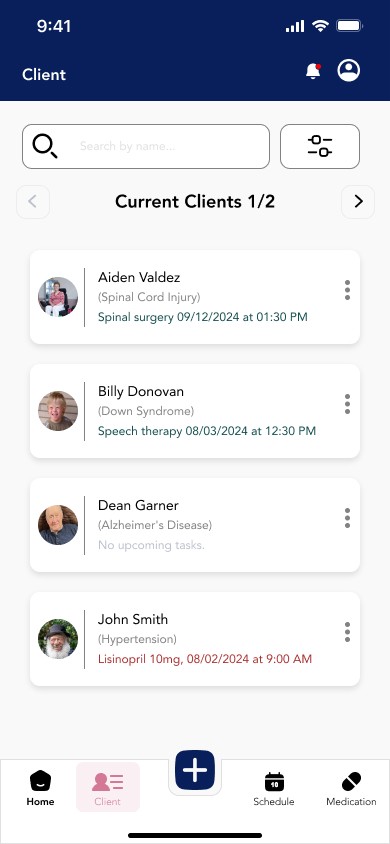
Stage 4: Prototype
Create wireframes and prototypes to visualize the solution and gather initial feedback from user testing.
Design
Features
Homepage: Clear and concise layout with prominent search functionality and quick links to popular destinations.
Booking Process: Streamlined steps for searching flights, selecting options, and entering passenger information.
Responsive Design: Consistent user experience across mobile and desktop devices.


Stage 5: Test & Iterations
Our goal for the usability test is to assess how well users can interact with the redesigned AirAsia MOVE website. We specifically looked at the flight booking process, including flight search, selection, and payment, to identify any usability issues and gather feedback to improve the website.
Usability Test
Participants
5 participants, aged between 18 and 65.
Tech-Savviness: Mix of tech-savvy and less tech-savvy users
Experience with AirAsia
Frequent travelers who have booked flights online.
Infrequent travelers who have limited experience booking flights online.
Geographical Location
Users from different regions to understand diverse perspectives and needs.
Task Flows
Task 1: Flight Search Use Quick Search
Task 2: Review Flight Details and Select Flight
Task 3: Enter Passenger Information and Complete Payment
(Repeat the same steps on the responsive website.)
Results
Success rate: 100%
Error Rate: 0%
Insights and Improvements
All participants agreed that the buttons and icons are easy to understand, leading to a more efficient task flow.
All participants completed the tasks with a 100% completion rate and a 0% error rate.
(Quote) Participant 3: "The text hierarchy and highlighted sections make it easier to navigate to the flight details or order confirmation page."


Conclusion
Takeaways
User-centric design is crucial: Prioritizing user needs and preferences leads to more intuitive and effective designs. By understanding the pain points and goals of different user personas, we created a more user-friendly platform.
Responsive Design Enhances Accessibility: Ensuring a consistent experience across devices is essential in today’s multi-device world. A responsive design not only improves usability but also increases user satisfaction and engagement.
Iterative Testing and Feedback Integration: Continuous usability testing and incorporating user feedback at each design stage is vital for identifying and addressing issues early. This approach leads to more refined and effective final designs.
Challenges Faced
Balancing Simplicity and Functionality: Striking the right balance between a simple, clean design and providing comprehensive functionalities was challenging, ensuring all necessary features are accessible without overwhelming the user required careful planning and testing.
Ensuring Consistency Across Devices: Creating a seamless experience across both mobile and desktop platforms presented technical challenges. Ensuring that the design was responsive and functional on all devices required significant testing and iterations.