AirAsia move
Creating a Responsive Design Optimized for Both Mobile and Desktop Users.
ROLE
UX/UI Designer
tool
Figma
YEAR
2024


I understand the frustration users have with unclear flight options and a complicated booking process on the AirAsia MOVE platform. I redesigned the website to address theses pain points and enhance the overall user experience for travelers.
Project Overview
Currently, there were 2 major pain points. Many users feel frustrated while navigating the website. It takes people a long time to book a flight, therefore, it causes a lot of drop offs.
To solve these issues, it was important to provide a more intuitive and faster way for users to find information and manage bookings. A clear and straightforward booking process, especially for mobile users, is essential. Additionally, an updated design with more interactive and user-friendly elements will enhance the overall experience for users.
Timeline
From research to final prototype in 4 weeks.
Background
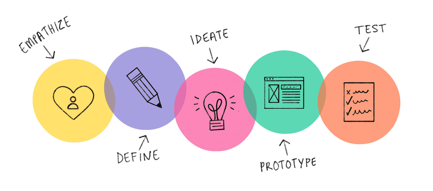
Process
This category details the step-by-step approach taken during the project.
Stage 1: Empathize
Conducted UX research to identify existing time and task managing challenges and user preferences. Research methods included user interviews, competitive analysis, and user personas.
Stage 2: Define
Clearly articulate the problem to be solved and the goals of the project.
Stage 3: Ideate
Generate ideas and solutions to address the identified problems and needs.
Stage 4: Prototype
Create wireframes and prototypes to visualize the solution and gather initial feedback.
Stage 5: Test
Evaluate the usability and effectiveness of the prototype with real users.
Research
We need to understand the users, their needs, and the pain points they experience with the current AirAsia MOVE website.
Research Objectives
Identify common issues users face when navigating the current AirAsia MOVE website.
Determine the specific pain points in the flight booking process.
Understand user preferences for accessing additional services such as hotels, car rentals, and travel insurance.
Business Goals
Optimize the booking flow and promote additional services.
Address pain points and provide a seamless experience.
User Interviews
Conducted with frequent and infrequent travelers, including tech-savvy and less tech-savvy users.
Key Findings:
Pain Points: Users struggled with confusing navigation, unclear flight information, and a complicated booking process.
Wishes: Quick and easy booking process, clear flight information, and seamless payment experience.
User Interview Insights
Simplify navigation.
Streamline booking process.
Consistency across devices.
Competitive Analysis
I conducted an in-depth analysis of 3 top ticket booking companies: Booking.com, Expedia, and Skyscanner to compare their strength and weakness.
Key Findings:
All 3 competitors features more polished design compared to top competitors.
Mobile responsiveness and seamless experience are critical areas for improvement.
The navigation is cluttered, making it difficult for users to quickly find what they need.
Design elements are not consistently applied across different pages, leading to a disjointed user experience.
The mobile interface may not be as smooth or intuitive as the desktop version.


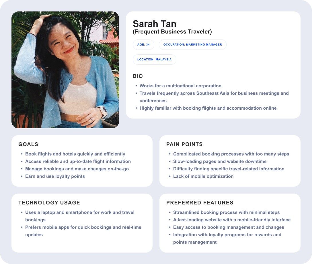
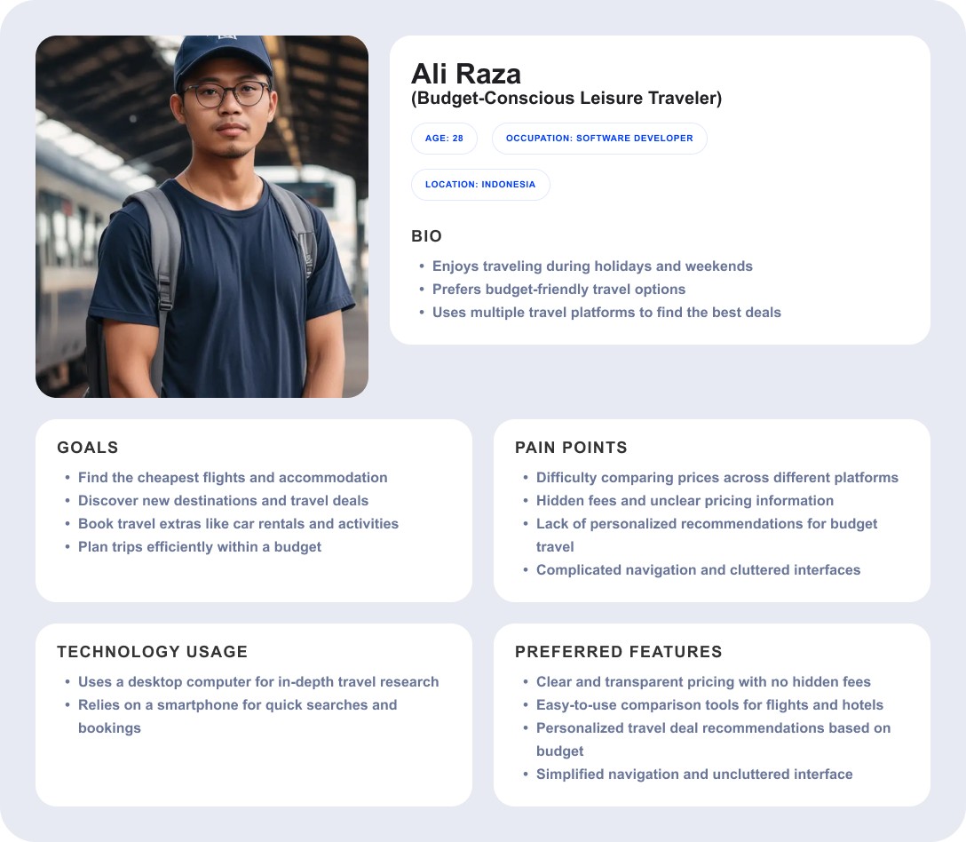
User Personas
Creating user personas helped to guide my ideation processes, and they helped to highlight the goals and pain points of AirAsia MOVE's users.
Key Findings:
Users Value Efficiency: Streamlined booking processes and quick access to information are critical.
Mobile Optimization is Essential: Users heavily rely on smartphones for bookings, updates, and quick access, making mobile optimization a high priority.
Pain Points: Users experienced frustration with
Complicated/Confusing Navigation
Slow-loading Pages
Cluttered Interfaces
Booking Management Challenges
Price Comparison Difficulties
Affinity Map
Key Findings:
Based on qualitative datas from the interviews, reveal several key areas for improvement on the AirAsia MOVE website:
Usability and Navigation:
Users encounter confusing layouts and difficulty managing bookings. To enhance user experience, navigation should be simplified.Booking Process:
The current booking process is complex and lengthy, with unclear steps. To reduce user frustration, the process should be streamlined.Mobile Experience:
The mobile version is difficult to navigate, with small text and small touch targets. Designing a responsive mobile interface will benefit all user groups, especially those on the go.Visual Design:
The layout design is confusing and lacks engagement. To cater to all users, more appealing visuals and simpler layouts should be introduced.Filtering Options:
There is a lack of sorting and filtering options. Developing specific flight filters for different groups will make the website more inclusive and user-friendly.
Usability and Navigation Issues
Difficult to find key information quickly.
Inconsistent layouts between flights, hotels, and transport.
Confusing layout when managing bookings.
Complicated process to compare different flight options.
Difficult to managing multiple bookings.
Booking Process Challenges
Unclear how many steps remain while booking.
Cannot easily go back and modify details like flight dates, baggage selection, or passenger information without restarting the booking process.
Mobile Experience Issues
Mobile version is not consistent and less intuitive than desktop.
Navigation is clunky.
Struggle with small buttons and unclear touch targets.
Dislikes the small text.
Visual Design Preferences
Simple but lacks appeal.
Confusing layout.
Lack of Filtering Options
Don't have a sorting and filtering options for users who are looking for specific flights.
Design
Create sitemap, user flows, wireframes, and prototypes to visualize the solution and gather initial feedback from user testing.
Sitemap
My goals is to ensure users and easily and quickly find relevant information.
Current Website's Problems:
Contains too many options in a single dropdown, making it difficult to find relevant sections. Some labels are also unclear (e.g., “MOVE” instead of something intuitive like "My Trips").
Important sections (e.g., Flight Status, Manage Booking, and Check-in) are buried under unrelated categories, requiring users to search or scroll excessively.
On mobile, the hamburger menu hides too many essential functions, forcing users to dig through layers of options.
Solutions:
Simplify menu categories and use clearer labels like “Flights,” “Hotels,” “Bookings,” and “Support.”
Group related menu items together in a logical order.
Prioritize most-used features on mobile.


User Flow
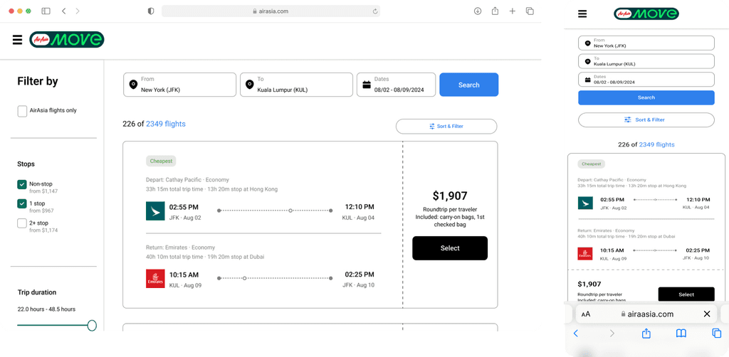
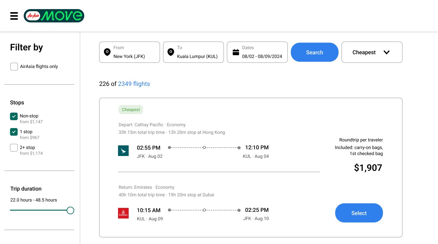
Users need to book a flight to Kuala Lumpur, Malaysia and complete payment on AirAsia MOVE' s desktop and mobile website.
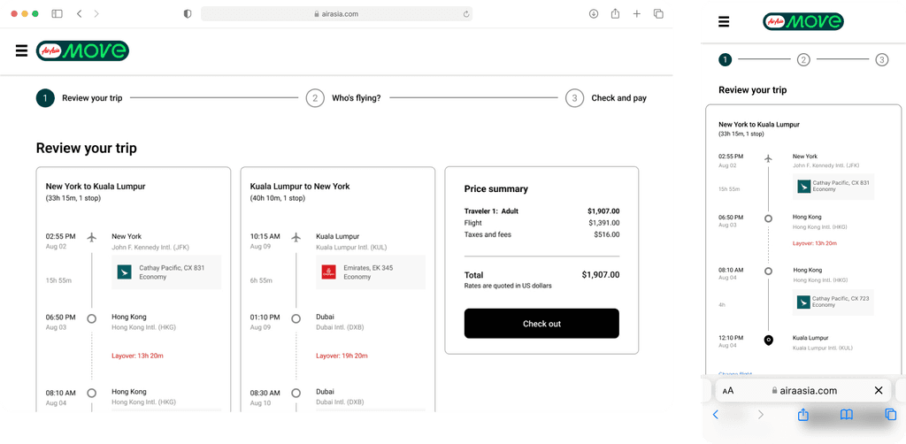
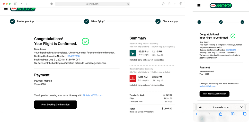
Through this user flow, I am redesigning the booking process. The booking process flow begins at AirAsia MOVE homepage, and it goes through different sections like flight search, flight selection, checkout, enter passenger details, select payment, confirm, and it ends at booking confirmation.
Pain Points:
Users cannot easily go back and modify selections like flight dates or baggage without restarting the process.
Users are required to log in before booking, adding unnecessary friction.
Users struggle to find their itinerary, boarding pass, and modifications after booking.
My design achieved the following:
Faster and clearer booking experience.
Speed up booking for one-time users with guest checkout option.
More flexible modification options, allow users to edit previous selections without losing entered data.
Improved confirmation and post-booking experience.
The end goal for users is to easily book a flight and receive a confirmation that includes all necessary travel details.

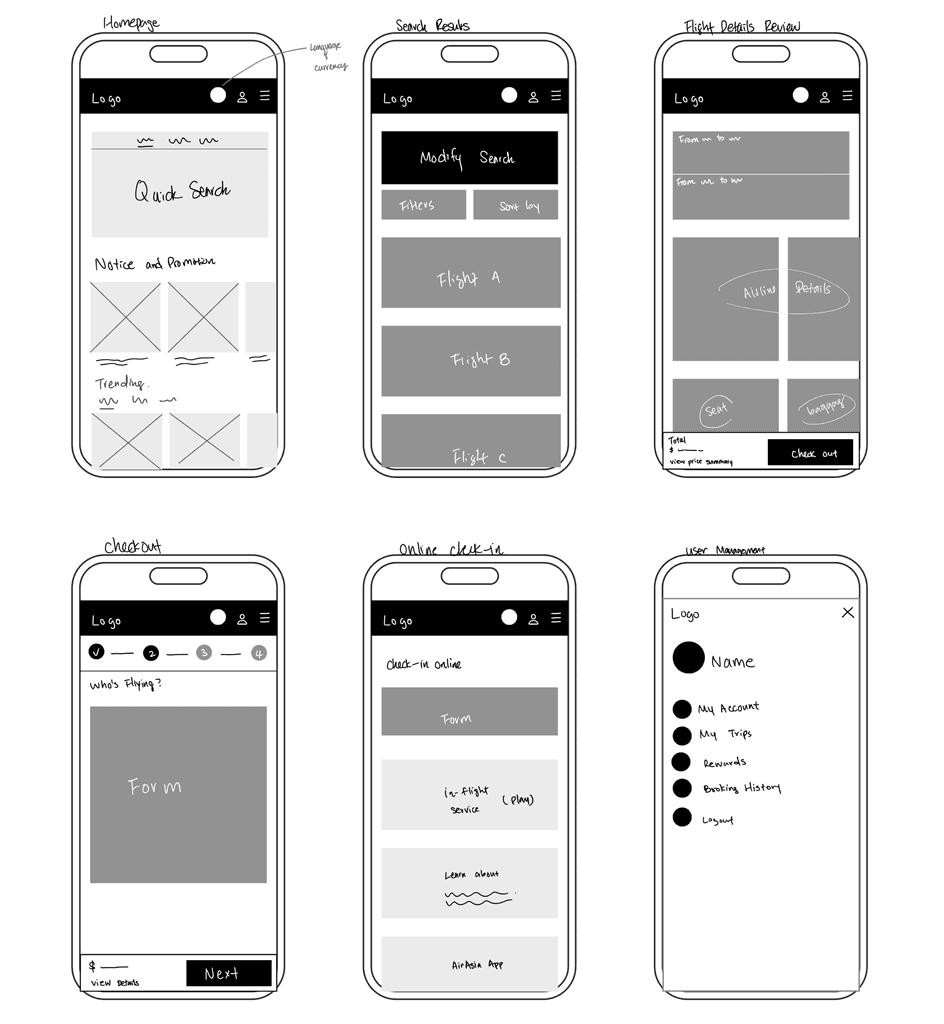
Lo-fi Wireframes


By implementing visual cards for quick links (Popular Destinations, Frequently Booked, and Recent Searches):
Users can quickly see popular and relevant routes without typing.
Flight deals are visually appealing, encouraging faster bookings.
Previously searched flights allow users to resume their journey seamlessly.


By implementing a well-structured filter & sort system combined with an easily accessible modify search option:
Users see relevant flights first, instead of scanning a long list.
No need to re-enter all details when adjusting search criteria.


By implementing a sticky sidebar with a real-time booking summary on the flight details page:
Users don’t need to rely on memory or switch between screens.
Users see the total cost upfront, reducing last-minute doubts.
Guides users toward completing the booking.


By implementing a clickable progress bar in the checkout flow:
Users can see how many steps remain, don’t feel lost or overwhelmed.
Users can quickly fix mistakes without losing progress.
No need to press the back button multiple times or reload the page.


By separating online check-in into its own dedicated page:
Users can access check-in directly without going through multiple steps.
Users can easily access mobile boarding passes, prevents confusion with managing flights.


By implementing a well-structured user management button in the top-right corner of the menu bar:
Users feel in control and confident.
Clear organization of important account-related actions, prevents unnecessary back-and-forth navigation.
Hi-fi Wireframes
Key Features
Navigation: Used a desktop sidebar menu and a mobile hamburger menu. And prioritized essential actions and most-used features at the top of the navigation.
Progress Bar: Implemented a progress bar in the checkout flow and allow users to modify details without losing entered data.
Booking Summary: Implemented a sticky sidebar with a real-time booking summary, so users can review their choices at any step.
Post-Booking: Provided a booking dashboard with clear sections for modifying flights, adding extras, and accessing boarding passes.
Quick Links: Used visual cards to display a “Popular Destinations” section, "Frequently Booked" section, and "Recent Searches" section on the landing page. It saves time for users and increases user engagement.


Usability Test
"The text hierarchy and highlighted sections make it easier to navigate to the flight details or order confirmation page." -Participant#3
Goals
To test how well users can interact with the redesigned AirAsia MOVE website.
Participants
5 participants, aged between 18 and 65.
Tech-Savviness: Mix of tech-savvy and less tech-savvy users
Experience with AirAsia
Frequent travelers who have booked flights online.
Infrequent travelers who have limited experience booking flights online.
Geographical Location
Users from different regions to understand diverse perspectives and needs.
Task Flows
Task 1: Flight Search Use Quick Search
Task 2: Review Flight Details and Select Flight
Task 3: Enter Passenger Information and Complete Payment
(Repeat the same steps on the responsive website.)
Results
Success rate: 100%
Error Rate: 0%
Insights
All participants agreed that the buttons and icons are easy to understand, leading to a more efficient task flow.
Iteration #1
Participants felt tired when scanning through ticket information. On the flight search results page, I introduced improved hierarchy and more scannable layout to make it easier for users to scan flights and pick out the relevant information quickly and easily. (e.g. price, flight time) And keeping consistency on the mobile version.
Before
Final
Iteration #2
Participants felt frustrated when scanning all available tickets on a single long page, it was challenging for them to find the previous ticket they were looking at. I changed from an endless rolling page to pagination. Now, it is easier and quicker for the user to target their flights.
Before

Final

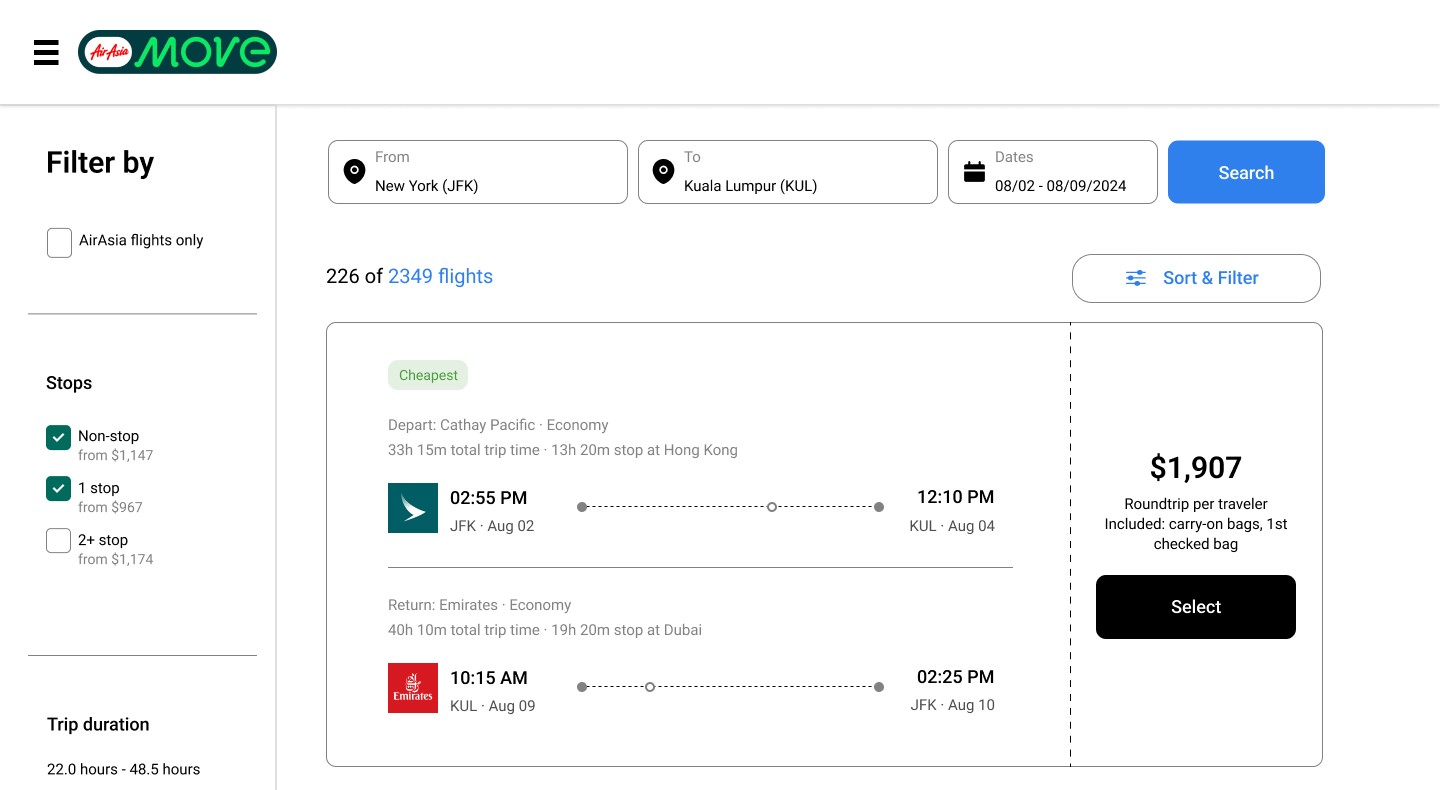
Final Design - Book a Flight
Conclusion
Challenges Faced
One of the challenges I faced was to strike the right balance between a simple, clean design and providing comprehensive functionalities. I learned to make a checklist of necessary features and ensure they are accessible without overwhelming the user.
Takeaways
Through this project, I learned about a consistent experience across devices is essential in today’s multi-device world.